Tuesday, October 31, 2006


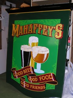
This sign was shipped to Baltimore, Md. back in December of last year.

The midterm elections are a week from today, and I'm probably more conflicted about voting than I've ever been. On one hand, I have a strong urge to pull the chain - to vote out ALL the incumbents, and let the Dems take over. I just wish I liked them any better than the clowns that are in power now. The problem is that no matter who I vote for, the system is the incumbent. Its the almighty Republicratic Demopublican Party, the same pack of howler monkeys hooting over the same old shit, with the only goal being to keep the voters distracted while they pick our pockets.

Truth? Like Nicholson says in a few good men, "you can't handle the truth." A political figure who tells it like it is, without pandering to the lefties or the Jesus screechers or talking outside the official script, is immediately labled a radical, or an extremist, or a nut, and marginalized and disregarded. The act of running for office in the United States requires selling out on some level, just to use the script required for support of whatever pressure group the candidate wants to be identified with.

Even the so-called "third party" candidates fall into this trap. Look at the Green Party, which is touted as a potential rival to the Demopublicans. In order to be a Greenie, you have to hold - or at least claim to hold - some of their basic ideas, the majority of which consist of juvenile histrionics about corporate greed and sky-is-falling enviro-facsism, along with a good big dose of truly idiotic hippy-dippy notions involving the efficacy of crystals, pyramids, vegetarianism and the regular application of high colonics. The Green Party platform is just the standard Democratic lefty notions taken to their logical conclusions, by which they become separated from anything resembling common sense, and enter the airy heights of utopian fantasy. Yet this is what passes for a semi-serious alternative to politics as usual.

The Democrats are always being accused of not having any "new ideas". Why does this come as a surprise? Long-term Dems don't want to hear any new ideas, at least not those that come painfully close to the truth, which is that the their long-cherished world view is a greasy mush of guilt, victim-worship and envy, leavened by the bitter realization that while much of the world at large may claim to agree with their principles, it will never give up any significant amount of material comfort to bring them into fruition. The whole central idea of being a Democrat is that someone, somewhere, is conspiring to cheat you out of your "fair share" of the material goodies in which our society is awash, and that the only enlightened approach to political economy is to find and punish those who, whether by luck, or connections, or skill - the reasons don't matter, only the results - have more material success than someone else. Individual effort, and its resulting accomplishments, are evidence of a character flaw, unless accompanied by a sense of guilt. For those with the temerity to achieve and NOT feel guilty, well, brother, we'll just see about that! This is the poisonous stew that congeals into such "progressive" ideas such as income redistribution, spawning legislation such as the Millionaire's Tax and other harping, confiscatory idiocy that seeks to level things out, without any acknowledgement of the consequences.

Then their are the Republicans. I speak of the present incarnation of the GOP, which has whored itself out to the so-called Social Conservatives in exchange for political power. In the forty years that the GOP was on the short-handed side of Congress, it learned the hard lesson that strongly-held opinions can only be trumped by other even more strongly-held opinions. Unfortunately, it surrendered the notion that these opinions ought to be based on some valid notion of reality, and traded the honest and sensible philosophy of individual rights and individual achievement for the power of opinions based on superstition, as in authoritarian religious belief. Yet the architects of this trade, mindful that the sort of people who won't put up with the collectivist looting from the Left aren't about to stand being ordered around by jesus-screeching numskulls, have gone to great lengths to cloak their puritannical obsessions in a cloak of "conservative freedom-loving values". To the extent that they have offered an alternative to the milk-toast socialism of the Democrats, this has been successful, but at what a price? The Republicans buy their power from every greasy little fraud in every backwoods pulpit in America, and as a result, instead of honest debate about serious national priorities, we have bloviated arguments over subjects such as gay marriage and creationism in the public schools. As far as I am concerned, any political organization demanding that the superstition-based creation myth of an obscure Middle Eastern tribe be presented as the scientific equivalent of the objective obsevations of Darwin, et al, or that seriously proposes that the legal marriage of a pair of flannel-wearing dykes is the beginning of the end of Western Civilization, deserves nothing so much as my undying revulsion and disdain.

Wednesday, October 18, 2006


In the last post here, I wrote about gold leaf and its substitutes. Here are a couple of photos that dramatically show the difference. The letter R is a plastic letter with a factory "metallic gold" finish. The SI are the same type of plastic letters, gilded with genuine 23k gold leaf. As anyone can see, there is no comparison. The letters finished in 23k gold leaf are brilliantly reflective and eye-catching, while the "gold" of the letter R is a dull, lifeless yellow-brown, the color of the diaper-filling byproduct of a three-month old infant. Calling this fake, nasty, babysh*t-brown color "gold" is an obscenity and an insult to intelligence, taste and aesthetic sensibility. That's why when you visit www.finestkindsign.com , everything you see that says gold, is real gold, not some cheap, shoddy imitation. Our clients know the difference, and now, so do you.


This window sign is done with 23k gold leaf and paint, in a process called reverse glass gilding. Reverse, because the image is rendered on the inside of the glass, to read from the outside. It's a fairly complex process, requiring a specific set of proceedures, from cleaning the glass to applying the gold to painting the colors and backing. I don't have opportunities to do much of this kind of work, which is a shame, really. Like a lot of traditional techniques, it has been replaced by cheap substitutes, such as the cheesy fake-gold vinyl films that are cut on a computerized plotter. The average customer usually doesn't know the difference unless they have a direct, side-by-side comparison; more to the point, the majority of modern sign makers can't be bothered to learn any technique that takes more than ten minutes and isn't disgorged by a computer with minimal effort. They tend to invest in machinery, rather than in developing basic skills, and the results are, for the most part, depressingly dull, artificial and predictable.

Admittedly, it's difficult to display the detail and power of this kind of work in a photo. What makes glass gilding so effective, when seen in person, is the play of reflected light and shadow best described as movement. The mirror-like reflection of the gold captures the motions of objects before it, attracting the attention of the viewer as he or she passes before it. This is why I describe images like these as not merely seen, but experienced. No artificial "gold" foil or digital print can create this magical sense of movement, for which there is literally no substitute.

There are more photos of this type of signage at my website, www.finestkindsign.com

Monday, October 16, 2006


Last Tuesday we installed the re-finished Trek tours sign in Westerly, RI. I wrote about these signs here last week, since then we used new posts to properly display the finished work. I won't go into the details about the challenges that accompanied this installation, except that this job reminded me - again - that installing signs is rarely straightforward and never routine!


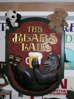
This was perhaps the most unexpected outcome of a job that I've ever experienced, and the story "bears" telling. These two signs were made in 2003 for a restaurant and pub being opened in Canada. The client was a local woman who had a family connection in a town in northern Ontario, and ordered these signs in the fall, with the instruction that they were to be ready for the end of November. Around December 1st she came to the shop, approved the finished signs and paid the balance due in full - approxamately $9000 - and asked us to hold the signs until the end of the year, when she planned to pick them up for transport to Ontario.

Well, months went by, with no word from the client. She did not return phone calls, but as the signs had been paid for, I didn't worry about it. In the summer of 2004 I found out, secondhand, that the Ontario project had been abruptly cancelled and the property sold. Still no word from the client, so the signs were hung up inside my shop, to wait for some sort of resolution.

Fast forward to 2006.... the coach of the local Stonington High School Girls' Basketball team came by to order a small sign to commemorate a State Championship. Stonington's mascot is a bear, and the school had just finished a new gymnasium, so I suggested the wall sign (the horizontal sign above left) , with a small modification, might look good in the new gym.

Now it appears that this is going to happen! Today the coach and the Athletic Director came by to look at the sign, and pending a final decision, the sign will go up in the new Stonington Bears gymnasium. Meanwhile, the second sign - with the bear cub holding a mug of beer on his belly - will still be in my shop, waiting, perhaps forever, for a new home.
.

Thursday, October 12, 2006


Over the years I've put up quite a few signs in Mystic - the business community there has been very receptive to the kind of work I do, and I enjoy working with clients who are willing to make a significant investment in the image their business projects. Mystic is a major tourist destination, so creating a sign for the Visitor Center at the Mystic Railroad Depot was a great opportunity to showcase the kind of work I do.

There are very few jobs that have no limits. When dealing with business clients there are always issues with design or budget - and in creating the depot sign I didn't want to have restrictions or make any compromises. So my first order of business was to approach the Chamber of Commerce, which was overseeing the Depot restoration, with an offer they couldn't refuse - I would donate the sign, free of charge. My only stipulation was that I had complete control; I would submit my design sketches to show the Depot Committee what I had in mind, but would not accept any changes or seek any advice. The proposition was essentially "take it or leave it".

This sign has just about all the bells and whistles. Hand carved raised dimensional letters, raised panels with incised hand carved letters, a carved compass rose, 23k gold, sterling silver and copper leaf, and a green crushed-glass smalt background. Lots of dimension, lots of gold, lots of play of light and shadow, very tactile. The Depot committee got all they could have wanted and then some.

At the time I did this job, five years ago, I valued it at $5000. Replacement value today would probably be a bit more. It's just a number; what I get out of this is having created a great sign that greets thousands of visitors to Mystic, and to have done exactly as it should be.


This was one of two matching painted sign for a restaurant in Westerly, RI, done this past summer. The material is DiBond, an aluminum/polyvinyl laminate, and the image is hand-painted with sign enamels. This type of sign is fairly typical mid-level work in my shop, yet the use of color and some fairly sophisticated design work makes it unique and effective.

This client was impressed by my signs on another Westerly restaurant, so from the beginning of our consultation, I knew she was looking to create a strong and appealing image for her business. At the same time, opening a restaurant is a daunting task, and she made it clear that she was working with a limited budget. Using a prefinished, man-made laminate like DiBond - which requires no priming or sealing - allows me to spend more time on design, while painting the sign allows me a virtually infinite color palette to bring this design to life.

The fact that this sign is handlettered is not really the point - this design could be cut and applied with multi-layered vinyl, or printed on a large-formant inkjet. The reason I display it here is to show that even with a limited budget, it was possible to design and create signs that exceeded my clients expectations.

Friday, October 06, 2006

In the ongoing daily struggle of business and life in general, I like to believe that every day is a good day, and some are better than others. Today wasn't one of the better days.

It started with a meeting with a very agressive potential client, the type who uses intimidation and ultimatums to gain advantage in a negotiation. I find this personally repulsive and insulting; had I not been there as a subcontractor to answer technical questions on a job, I may very well have walked out of the meeting. At the very least, had it been my negotiation to conduct, I'd have handled it very differently. After all the years I've been in this business, and given the level of work I've done and the images and successes I've created for my clients, I am baffled by the attitude of some business people that I am somehow trying to cheat them. I resent it when a client wants a cheaper price, but can't be up-front with their budget or requirements, expecting instead to manipulate me into doing the same work for less. This kind of game leaves me with a bad feeling for the whole process.

Tuesday, October 03, 2006


This week I'm finishing this job for a Westerly RI travel agency. This job involved refinishing a sign that was several years old, and had been lettered with vinyl, so the old vinyl had to be stripped and the signboard refinished with new colors, chosen by the client. The client wanted an upgraded look, but didn't have the budget for a new carved sign; the compromise was to purchase individual letters for the main copy, and finish them with 23k gold leaf. The rest of the copy was hand lettered. Although this is not my favorite way to do a sign - I prefer to use new materials and start from scratch - this sign will still look good and be an effective advertising tool, while staying within the client's budget restrictions.