Thursday, September 28, 2006

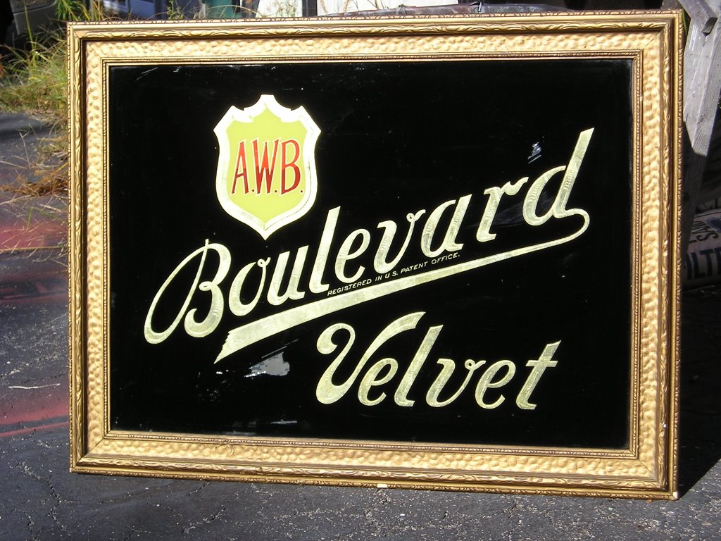
The official Finest Kind Sign website is now live, with several things still under construction, at www.finestkindsign.com Today I spent a couple of hour on the phone with Jeremy Fennema, my webmaster at www.builditbuyit.com learning how to edit pages. Okay, so it sounds easy on the phone... suffice to say I have great respect for the skills involved in website design. Anyway, there are now more photos up and some neat stuff to see, coming from the archives of the last 18 years in this business. Its interesting - to me at least - to see how my designs have evolved over the years; how some have aged well and others look dated or less than what I would want to do now.

The big change has come from computer-assisted design. It's so easy now to fine-tune a design, adjust copy size or spacing or try different letterstyles. In the past when everything was drawn and patterned by hand, it was a lot of work to make even small changes, and admittedly there were days when time constraints and exhaustion allowed things to be done less than perfectly. One bugbear that always pestered me, back then, was centering. I have a hell of a time looking and judging a center by eye - I'm always off, just a bit, whereas for lines being level and parallel I can spot an eighth-inch variation over a six-foot length. When an entire sign is patterned by hand and one line is an inch off center, you either re-do the pattern or figure out "shortcuts" - like pouncing (which means transfering the pattern to the signboard with powder) the whole sign, wiping away the off-center part, moving the pattern to re-center the offending bit, then pouncing just that line again. If it sounds half as effing tedious as it is, I've done an adequate job describing it. Now, I fine-tune the design on screen (where the justify feature is my friend) and the plotter perforates a perfect pattern (say that three times fast!) This saves me a hell of a lot of time and labor, allowing me to let machines do the tedious work and letting me do the painting.

Still, I can't over emphasize the value of those years of doing everything by hand. Traditional methods force you to pay attention to details and to have an intimate acquaintance with letterforms like nothing else. No computer program will ever replace or substitute for those skills, even if after all these years I still can't see center.

Wednesday, September 27, 2006


When I'm not painting signs I'm often out riding my restored 1972 Norton Combat Commando motorcycle. Norton was a British company founded in 1898, and was famed in racing circles from the twenties through the sixties. This beast has a high compression 750 cc vertical-twin engine with no electric starter - it's a man's motorcycle, designed, built and ridden by enthusiasts who loved bikes, loved riding and understood that a motorcycle isn't just a machine, it's a soul-satisfying, life-affirming experience. While it doesn't compete with modern Japanese repli-racers, a Commando was the dangerously fast sportbike of its day, and it doesn't really wake up and pay attention at speeds under 50 0r 60 mph. On the open road, give it a handful of throttle and it will grab you by the ass and go, and it isn't hard to find yourself at a buck ten or more passing semis and slow-poke Subarus on the interstate, and realize you are still accelerating. That's about as fast as I need to go on just about anything, not to mention a thirty-four year old motorcycle.


After struggling to publish these pics yeaterday, now I get two of the same... These are also part of the Schooner Wharf project from 2003.


Here's a pic of the Schooner Wharf project that i wrote about yesterday.

Tuesday, September 26, 2006

This morning I stopped by the Mystic Chamber of Commerce, which is located at Schooner Wharf in Mystic. Schooner Wharf, finished in 2003, was my single largest sign project to date. There are six fairly large wall-mounted signs with gilded individual letters, all finished with 23k gold leaf, and two oval projecting signs, along with several signs for other businesses on the premises.

The large rectangular signs are all made with DiBond laminate and framed in cedar. The round-faced plastic letters are from Gemini Inc., and were gilded with 23k gold leaf imported from Germany. The project used three full packs of gold - each pack containing 500 leaves, 3&3/8 x 3&3/8 inches square, all hand-laid and burnished. There is really nothing that shows off the beauty and power of gold leaf more than large round-faced letters, and the Gemini letters are great because the smooth, consistent sufaces are an ideal substrate for gilding.

In the 19th and early 20th century, signs with raised gilded wood letters were the quality standard for outdoor signs. A larger sign shop might manufacture their own letters, while other shops would purchase them from manufacturers such as Spanjer Bros. of Chicago. Those letters were made of wood, usually pine, and were highly labor-intensive; the letter blanks had to be hand-carved and sanded to acheive the rounded profile. When finished, the letters were literally boiled in linseed oil as a preservative, then painted with several coats of white lead - a highly toxic, but extremely durable primer - then pained with several coats of enamel before, at last, being gilded. The painting process alone required several months - each coat of white lead took over a week to dry - with each coat being hand-sanded to acceptable smoothness before the next step. When the painting and gilding process was complete, the letters wood be screwed from their backs to the signboard, usually painted sheet metal with a wood frame. The traditional background for gold letters was black smalt, a fine-grained colored ground glass, which was adhered to the panel with glue. The results are striking - a smalt background displays gold letters with a look similar to gold jewelry on velvet. In the case of the Schooner Wharf signs, I had strongly encouraged the use of green or black smalt for the background, but was overruled by the client; these signs have a green enamel backround.

The use of gilded plastic letters, while not purely traditional, allows these signs to have the look of traditional wood-letter signs, without the labor costs required by the lengthy process of carving and painting wood letters.


Yesterday we installed this hand-lettered sign for Dr. Chris Kiersko of Westerly Chiropractic. Dr. Chris is moving his offices and re-naming his practice, and had suggested the name on an angled panel; I designed the logo and sign based on that. The sign itself is DiBond, a laminate panel of aluminum with a polyvinyl core, that has become my hands-down favorite substrate for this type of job. The installation required the removal of an existing electric sign cabinet, a somewhat complicated process involving a rope sling to lower the cabinet from the roof, and insect spray to deal with the wasps that always seem to nest in these darn things! Helping me with this installation was my good friend Bob Rochon, whose own shop, Creative Signworks, is in Millbury, Massachusetts.

You can see more of my hand-lettered signs at www.finestkindsign.com

Monday, September 25, 2006


Fall has arrived and with cold weather on its way, I reinstalled my coal stove today. This is a restored 19th century "pansy" stove, which burns anthracite, or hard, coal mined in Pennsylvania. With the price of propane - my other heat source - having gone ballistic in the last year or so, coal really makes sense. A 40 lb bag of anthracite costs $5, and in the coldest weather last year it burned a bag every two days and kept my shop comfortably warm and dry - that's important for paint to cure properly, not to mention keeping me warm enough to work. More than that, burning coal is a hands-on process - and if you've read much of this blog, you have already got a sense of how that fits my style and personality.

The stove came from a restoration shop in Rhode Island, with a website at www.antiquestovehospital.com. Owner Emory Pinero is an old-time swamp Yankee, living on a backroad in Little Compton, where he has a couple of barns and sheds overflowing with what to the untrained eye, looks like rusted junk. To Emory, this junk is all bits and pieces of old stoves - grates, doors, fireboxes and the like - from dozens of mostly New England manufacturers, all long defunct. He cleans and sandblasts the pieces, makes new parts when necessary, and restores stoves to like-new or better-than-new condition. If you have ever wanted an old stove or just like old and unusual stuff, check out the antique stove hospital.


This is one of two matching signs for the Weekapaug Golf Club in Westerly, Rhode Island, that were finished and installed in June. The signs are SignFoam HDU material, with the background carved and the letterfaces cut to a prismatic shape. the backgrounds were then finished in green smalt, a crushed colored-glass material, which gives the background a soft, velvety appearance. Letter are finished with 23k Gold Leaf.

For a look at some of our other carved signs, visit www.finestkindsign.com


These are closups of the glass sign showing the detail of the etching in the letters.


I'm not much of an antique collector, but once in a while a piece comes along that I've just got to have. Such is the case with this beautiful glass sign, which came to me through Stonington antique dealer Bill Clark. The lettering of Boulevard Velvet and the outlines of the shield and the red AWB letters is gold leaf, with centers that look to be acid-etched, and the background is painted in black enamel. The grey patch in front of the V is where the enamel has peeled from the back of the glass; otherwise this is in extraordinary condition. A.W.B. stands for Augustus B. Wimpfheimer, whose family owned the Wimpfheimer velvet mill in Stonington since the 1880s. From the wavyness of the glass, Bill thinks this sign dates from the 1890s, and at one time it would have been displayed in the company's sales office in New York.

Friday, September 22, 2006


This is a job just finished about two weeks ago , replacing a sign that I first did in 1998. The original sign was built with solid 2" thick SignFoam High Density Urethane, and was installed with steel bars that ran down the sides of the sign. It lasted eight years, until broken by vandals in June. The replacement sign is slightly smaller, but the big difference is in construction. The new sign was built with two separate faces, laminated over an internal frame of 1/4" x 1 1/2" steel, which runs all the way through the sign, allowing for a smaller sign to hang below it. The curved framing on the top of the original sign was also HDU; on the new sign this is mahogany. These changes will make the sign far less vulnerable to being shattered by a single blow, which was the unfortunate fate of the original sign.

Design-wise, this sign has some interesting features. Aside from the classic V-carved lettering, the background of the leaf-and-branch motif is carved away, and the texture of the leaves is also lightly carved to resemble the natural veining. To achieve the unique reddish coloring of the European copper beech, the leaves are gilded with pure copper (metal) leaf, then glazed with a clear varnish tinted with a mixture of green and brown, before a final coat of UV urethane clearcoat. The same copper is used as an accent on the edges of the sign, then also clearcoated, as copper will tarnish if left unprotected. The lettering is finished with 23k gold leaf. This sign is a great example of the classic hand-carved signs that have earned Finest Kind Signs its reputation for quality and value.

Wednesday, September 20, 2006

This being my first experience with blogging and website creation, I'm learning a lot as I go. The website is almost done though the domain name - www.finestkindsign.com - has had an unexpected problem with the registry.
It's now past six pm, and I'm expected home, so with apologies for the banality of this post, I retire.

While our official website at www.finestkindsigns is all about contact info and the photos of work we've done, it is by design somewhat static - semi-permanent photos and text. The blog is much more personal, immediate and behind-the scenes. In it I talk about signs and design, but you're also likely to get my opinions on the local zoning board, the Red Sox, and motorcycles, among other things. You'll see pictures of signs in the works, the shop, Augie the Doggie, and whatever else I feel like posting. I have a lot of interests aside from signs, and I get a kick out of being able to share them here.

About the whole hand lettering thing.
Here's a sign related subject I get passionate about, so this is a perfect "first post" for the blog. I'm a practitioner of a dying trade, that of the traditional sign painter. Technology, in the form of computer-driven vinyl cutters, routers and large format inkjet printers, have made my brushes, paints, and mahlstick virtually obsolete - yet though I have and use technology, I have made a conscious decision to produce the majority of my work by hand, using traditional materials. Why? Well, the best way to explain it is that having learned this elemental part of the trade back in the 80s, I have a deep appreciation for what's involved. Learning to letter with a brush is probably one of the most difficult activities a person can attempt, requiring the development of fine motor skills, an eye for detail, and a sense of rythm and proportion. The letterer has to be able to feel the viscousity of the paint in the brush, the response of the brush to the painting surface, the flow of the paint from the brush, how that flow is altered and controlled by the presure and movement of the fingers.
That's the technical side of it, but the real reason I keep doing it is all in my head. Everything else in this trade has been made faster easier - with plotters, printers, CNC routers, etc. - but not brush lettering. As I said, learning to letter is extremely difficult. It requires long hours of practice - an oldtime signman once estimated that to competently paint a letter "O" under two inches high required approximately two thousand hours of practice. There are no shortcuts, no special tricks, just diligence and patience. Brush lettering can't be learned in a weekend, or from a seminar, and in a very real sense it cannot even be taught. The only thing that can be taught is how to practice; the would-be letterer has to find the time, and develop the patience and discipline to practice...and practice...and practice.
Sounds pretty horrible, doesn't it? In my case, practice was all after hours at the shop where I worked in Phoenix, Arizona from 1985 to 1988. My boss and mentor, Brad Lindsey, often worked late, and I would frequently stay into the evening, practicing at the bench on old newspapers. Those evenings - talking to Brad, listening to his stories of childhood in South Carolina, the smell of paint and the background of country music on the radio - will always be some of my best memories. But the best part of all that practice is the magical moment when it starts to work - when after hundreds of smeared and crooked brushstrokes, suddenly the paint and the brush and your fingers start to cooperate, and the strokes flow from the brush exactly as you imagined. It's not that you suddenly are a competent letterer, but the light appears at the end of the tunnel, and from this point the practice becomes easier, and as it becomes easier, it also becomes more compelling.
As hand lettering becomes rare, it also becomes more valuable - but in the end the reason I do it is because I like it. As any good brush letterer can tell you, lettering is its own reward. It's a relaxing, unhurried, focused activity with it's own rythm, timing, and some say, swing, that defies explanation. I personally love lettering on a warm summer evening at the shop, when the phone doesn't ring, the Red Sox are on the radio and the peepers out in the marsh are all singing for love. Betcha there's not too many jobs you can say that about.

For a person starting out in the sign trade today, there's no real incentive to learn lettering by hand. The machines can do it all - but in doing so, they seperate the humanity and skill and pride from the end result, and turn the sign into a commodity. A hand lettered sign, on the other hand, is a connection to the letterer; to his skills, those long hours of practice, and ultimately to the satisfaction and joy taken from the work itself. There's a word for all that, a very overused word that is applied to many things, but is really all about one basic human need. That word is Art.