
Daily doings at Finest Kind Signs.


Here's another picture of Mahaffeys with the new sign. I'm going to have to get back to Charm City sometime soonso I can drink here again. If you look at their site http://www.mahaffeyspub.com/ you'll see how desperately they needed a new sign.
And remember... the secret to succesful drinking is good nutrition. So while enjoying those delicious draught microbrews and Belgian ales, take a look at the menu... this place has some of the best pub food in Baltimore. Cheers...

In December of 2005 I shipped this sign to a pub owner in Baltimore, Maryland. The owner didn't install the sign immediately; instead, he unpacked it and kept it in the bar for several months, where it suffered some damage. The price to ship it back to be repaired was prohibitive; consequently, it languished for over a year until last month, when I came in contact with a sign man in Maryland named Mark Kottwitz. Mark took on the task of repairing and installing the sign, and here it is at last.

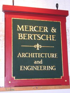
 I've been doing business with Bob Mercer and Bill Bertsche for years; so I was very pleased to do a new sign for their office in Old Mystic. This is a perfect example of a carved sign in the classic New England style; very traditional "tablet" design, with gold leaf on a deep green ground, framed in cottage red - nothing outrageous or unexpected, just the sort of sign that speaks of pride, quality and professionalism.

It's been a while since I've written here, so I want to share a project I'm currently working on in the shop.
This is a sign for a lakefront cottage called "Windy Waters". It's hand carved in SignFoam HDU; in this picture you see it as I have just finished carving the lettering and the "fan" image. You can also see the pencilled line which shows the eventual shape of the panel, which I will cut out after the carving is complete.
This sign will also have a painted picture of a sailboat, which will go inside the circle you can see in the upper half of the sign. This is a fairly typical carved sign from my shop; to see other examples go to www.finestkindsign.com
Here's to the best-laid plans. I promised to cover a carved sign project from beginning to end; but I got real busy and plum fergot. We'll try again some othe time. In the meanwhile I've pushed a couple of other nice projects out the door, and now it's two weeks til Christmas and time to think about what the last year taughtme and what the new year will bring. Stay tuned.
